Holy IeltsPursue your goal to the very end

Menu

  • Dashboard
  • Grade Writing
  • Grade Speaking
  • Practice ReadingComing soon
  • Practice ListeningComing soon
    • Writing tests
    • Speaking tests
    • Reading testsComing soon
    • Listening testsComing soon
  • Attempt history
Upgrade to PremiumUnlock unlimited gradingSign in
  • Dashboard
  • Grade Writing
  • Grade Speaking
  • Test Library
Messenger

Writing test library

Pick a test by topic and difficulty, then practise under real exam conditions.

Keyword
Part
Question type
Status

21 tests

Task 1Map

Class size in Australia

The map below shows the size of classes in primary (elementary) schools in four states in Australia in 2010. Summarise the information by selecting and reporting the main features and make comparisons where relevant.

81,135 attempts20 min
Task 1Map

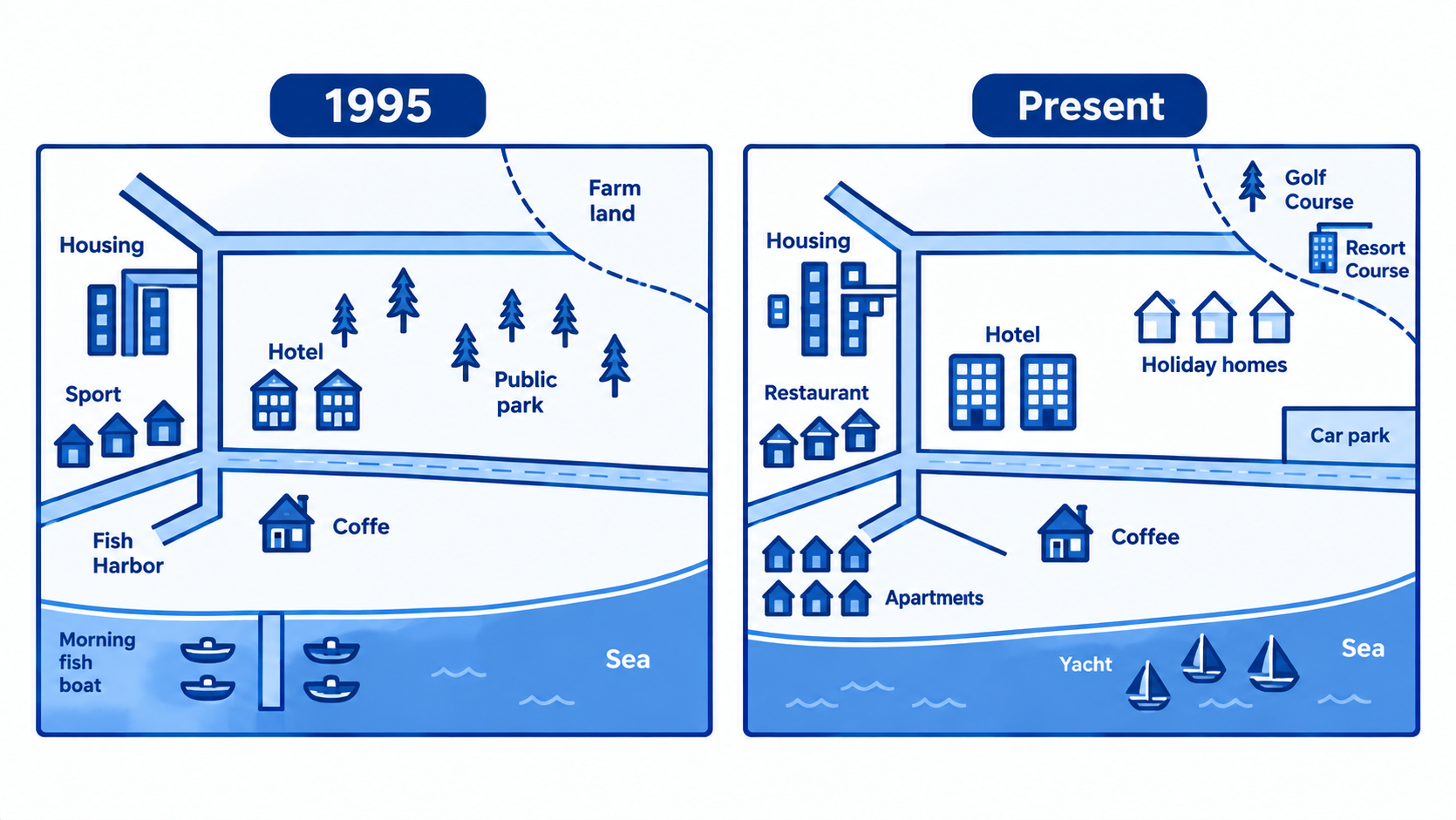
Ryemouth village development

The maps above show the development of the village of Ryemouth between 1995 and present.

30,446 attempts20 min
Task 1Map

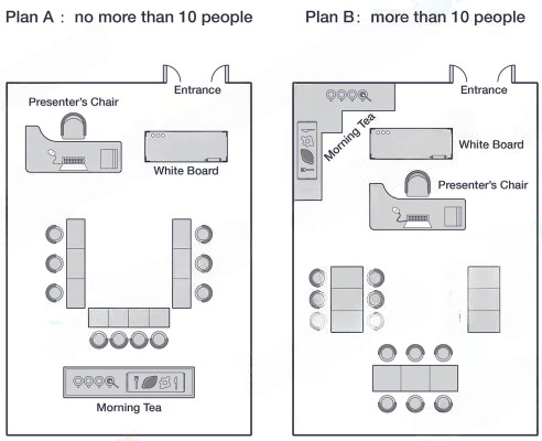
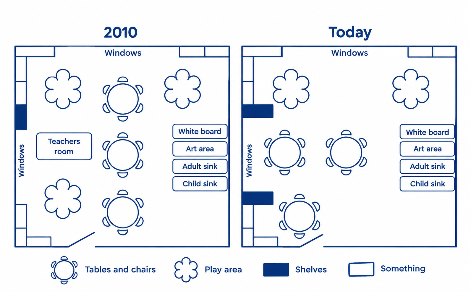
Room for Training Sessions

The plans show the room layouts for training session for up to ten people and more than ten people. Summarize the information by selecting and reporting the main features, and make comparisons where relevant.

63,844 attempts20 min
Task 1Process diagram

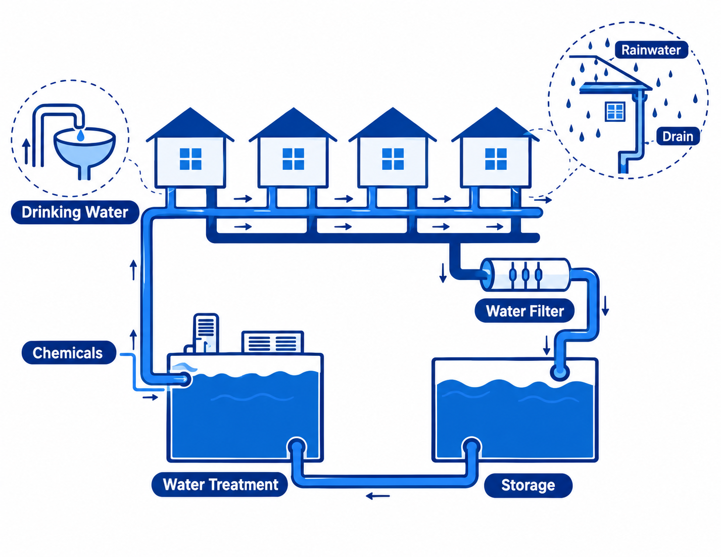
Rainwater collection process in Australia

The diagram shows how rainwater is collected for the use of drinking water in an Australian town. Summarize the information by describing the main features of the charts and making comparisons where appropriate.

94,377 attempts20 min
Task 1Process diagram

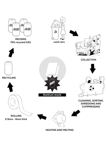
Aluminium can recycling process

The diagram below shows the recycling process of aluminium cans. Summarize the information by describing the main features of the charts and making comparisons where appropriate.

12,006 attempts20 min
Task 1Process diagram

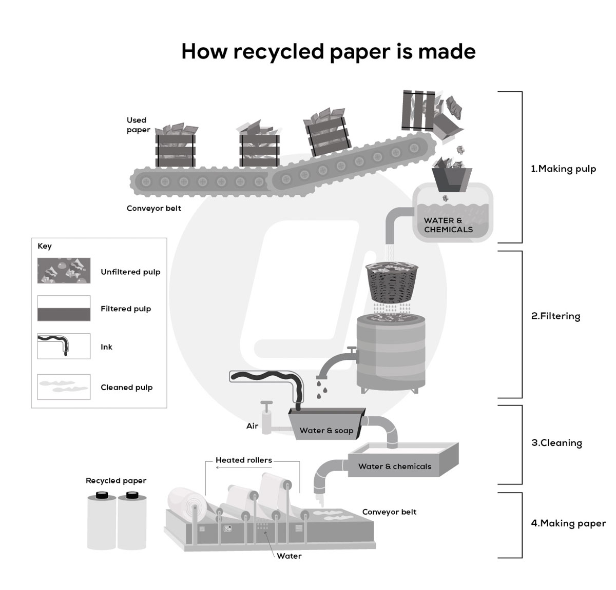
Paper recycling process

The diagram illustrates how recycled paper is made. Summarize the information by describing the main features of the charts and making comparisons where appropriate.

57,177 attempts20 min
Task 1Mixed charts

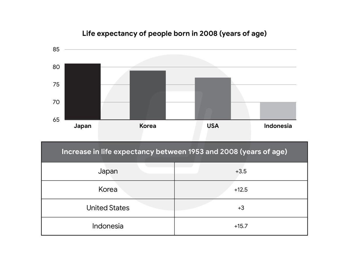
Life expectancy trends

The bar chart gives information about the life expectancy in Japan, Korea, the United States, and Indonesia, and the table shows the change in life expectancy between 1953 and 2008.

73,433 attempts20 min
Task 1Mixed charts

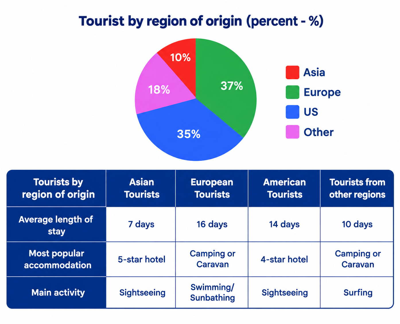
Tourist data Australia

The chart and table below give information about tourists at a particular holiday resort in Australia.

21,618 attempts20 min
Task 1Mixed charts

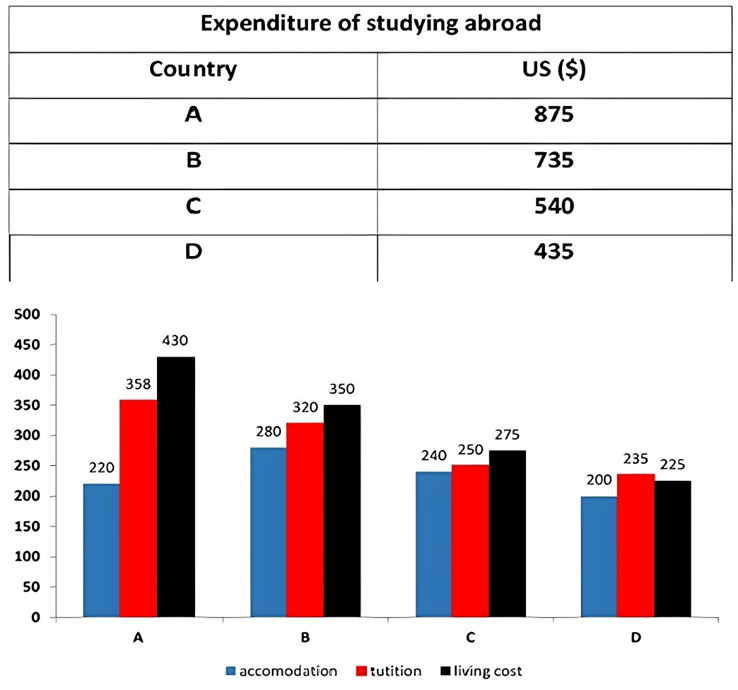
Student spending abroad

The table and chart provide a breakdown of the total expenditure and the average amount of money spent by students per week while studying abroad in four countries. Summarise the information by selecting and reporting the main features, and make comparisons where relevant.

65,970 attempts20 min
Task 1Table

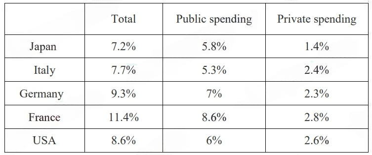
Spending on health

The table below shows information about spending on health in five different countries in 2002.

28,726 attempts20 min
Task 1Table

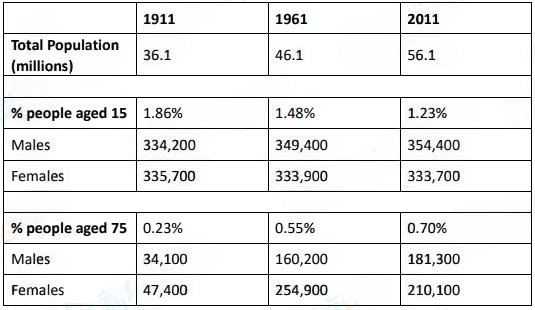
15 & 75 year-old Males & Females

The table below shows the total population and the proportion of males and females aged 15 and aged 75 in the UK from 1911 to 2011.

21,268 attempts20 min
Task 1Table

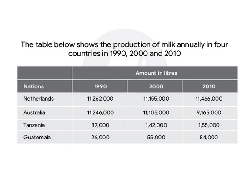
Milk Production

The table below shows the production of milk annually in four countries in 1990, 2000 and 2010.

63,436 attempts20 min
Task 1Pie chart

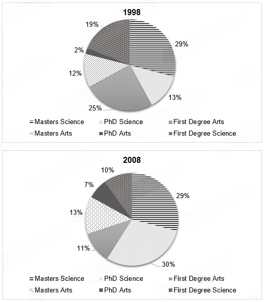
Graduate qualifications

The charts below show the proportion of graduates with different qualifications working in one engineering company in 1980 and 2008.

65,914 attempts20 min
Task 1Pie chart

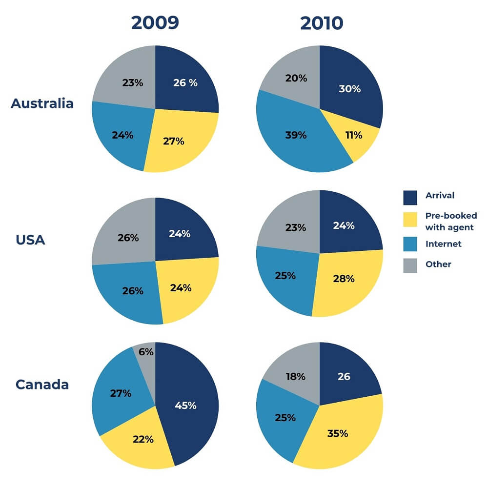
Booking online English courses

The pie charts below show the methods used by international students when booking online English courses in three different countries in 2009 and 2010.

68,155 attempts20 min
Task 1Pie chart

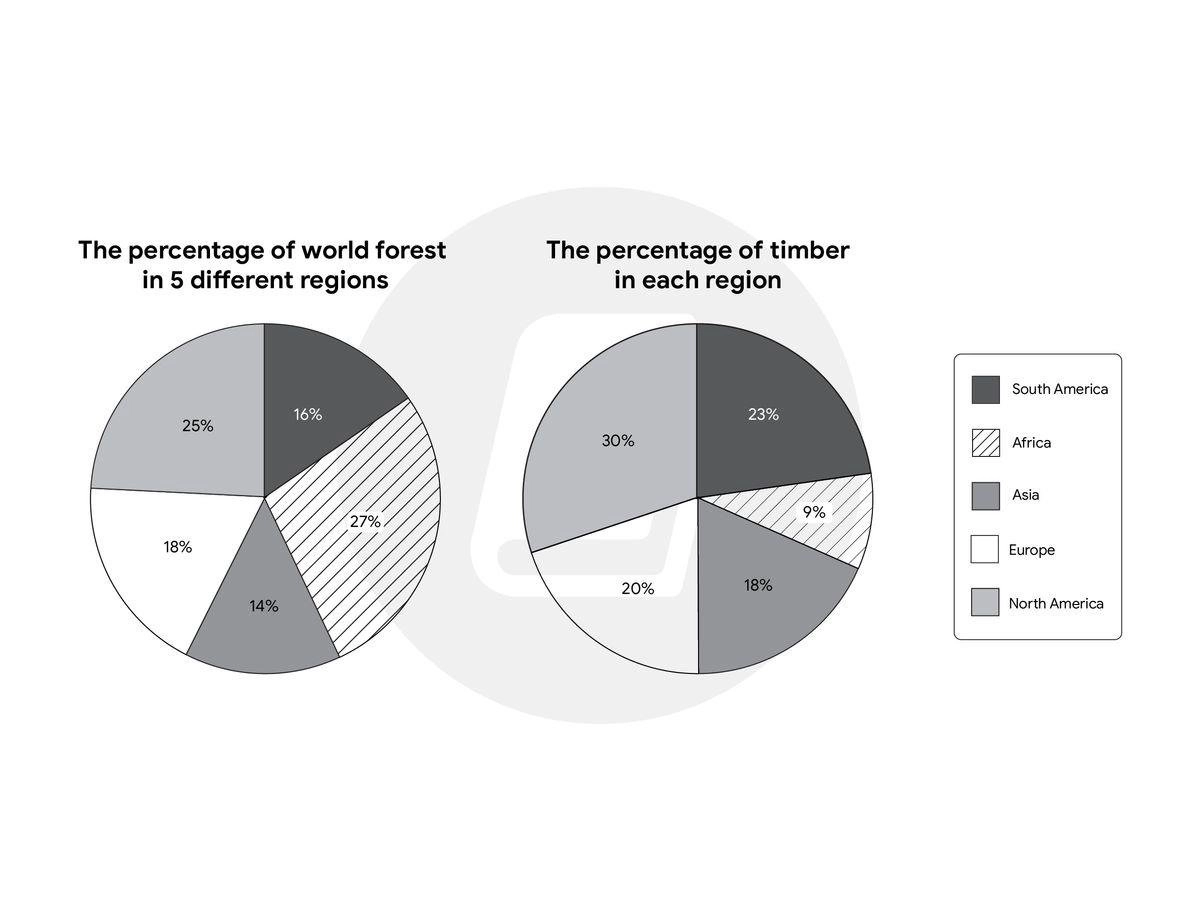
World’s forests

The pie charts give information about the world’s forests in five different regions. Summarize the information by selecting and reporting the main features, and make comparisons where relevant.

74,266 attempts20 min
Task 1Line graph

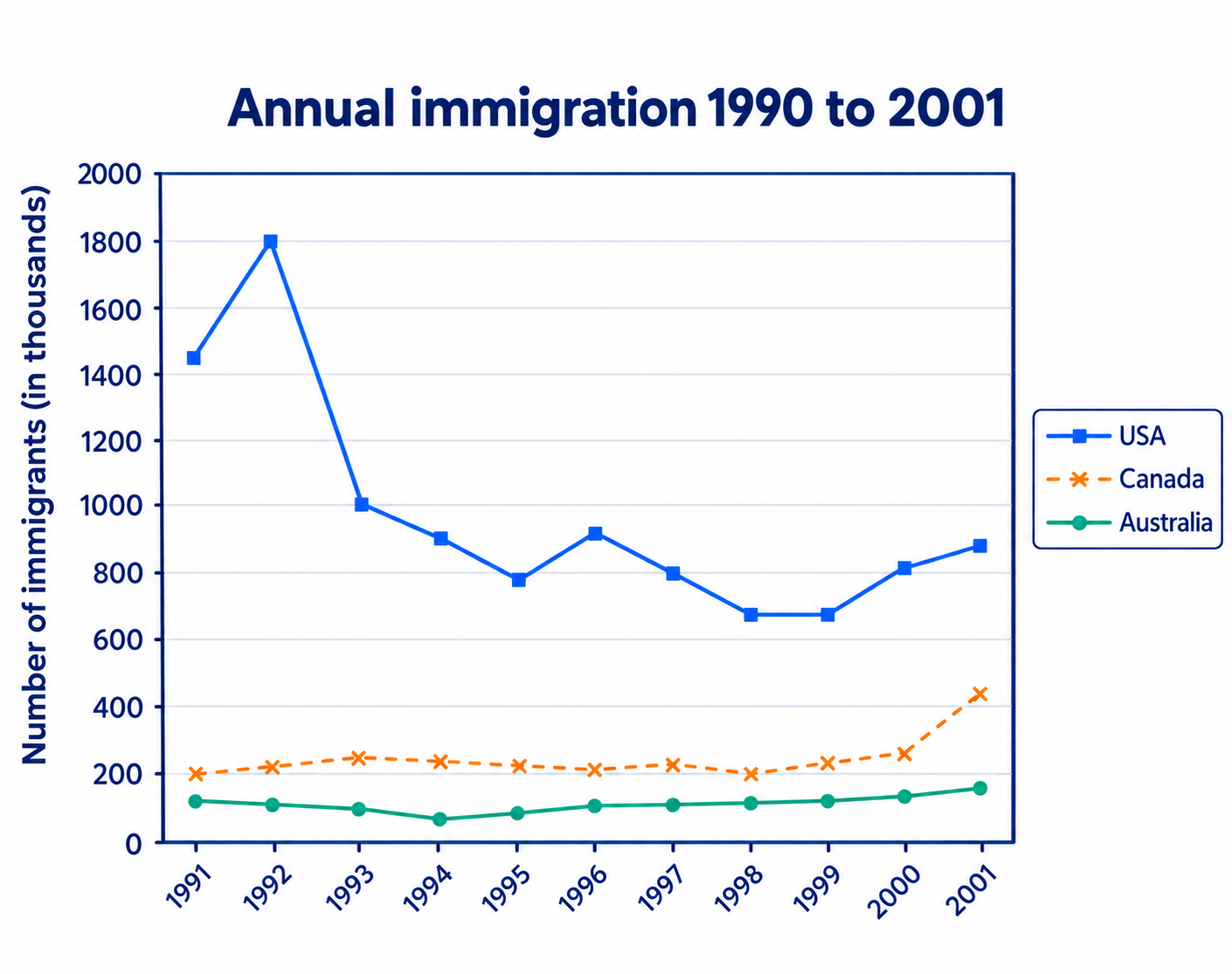
Immigration trends

The line graph shows the number of immigrants to 3 different countries (USA,Canada, Australia) from 1991 to 2001. Summarise the information by selecting and reporting the main features, and make comparisons where relevant.

75,123 attempts20 min
Task 1Line graph

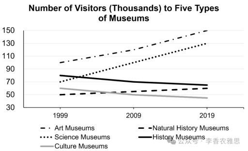
UK museum visitors

The graph below shows the number of visitors to five different types of museums in the UK from 1999 to 2019. Summarise the information by selecting and reporting the main features, and make comparisons where relevant.

37,635 attempts20 min
Task 1Line graph

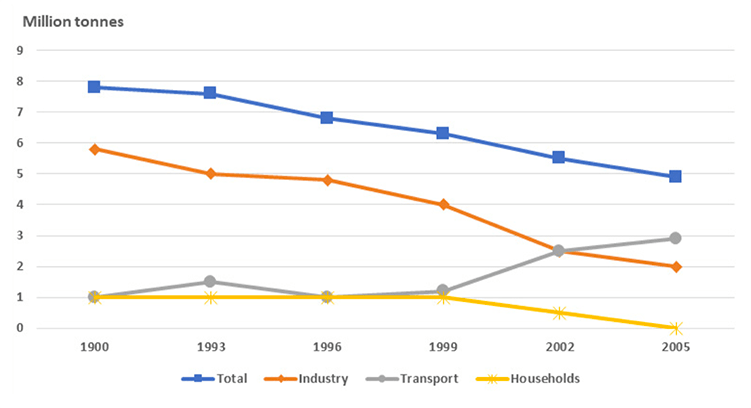
Air pollutants in the UK

The graph below shows different sources of air pollutants in the UK from 1990 to 2005. Summarise the information by selecting and reporting the main features, and make comparisons where relevant.

14,093 attempts20 min
Task 1Bar chart

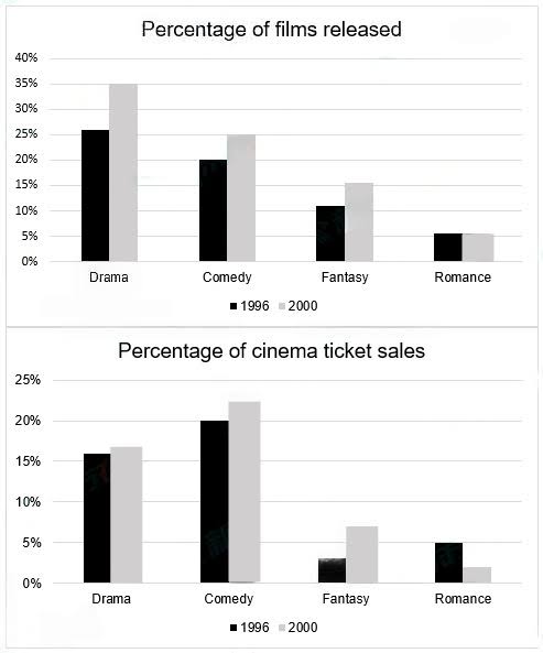
Films and Ticket sales

The graphs below show the total percentage of films released and the total percentage of ticket sales in 1996 and 2000 in a country. Summarize the information by selecting and reporting the main features and make comparisons where relevant.

61,720 attempts20 min
Task 1Bar chart

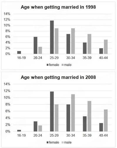
Ages when getting maried

The charts below give information on the ages of people when they got married in one particular country in 1996 and 2008. Summarize the information by selecting and repairing the main features, and make comparisons where relevant.

40,499 attempts20 min
Task 1Bar chart

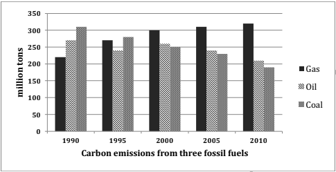
Carbon emissions of fossil fuels

The chart below shows the level of carbon emissions of three types of fossil fuel in the United Kingdom from 1990-2010.

80,443 attempts20 min